This post gives an overview of the third of the three processes in the Quality Management Knowledge Area, namely process 8.3 Perform Quality Control, by listing the inputs, tools & techniques, and the outputs of the process. Perform Quality Control belongs to the Monitoring & Controlling Process Group, and focuses on the product or deliverables, as opposed to the previous process 8.2 Perform Quality Assurance (in the Executing Process Group) looks at the processes.
1. Inputs
The first three inputs come the first quality process, process 8.1 Plan Quality. Some inputs from the Integration Knowledge Area (Work Performance Data and Approved Change Requests), and of course the deliverables themselves which are to be sampled and inspected as a part of this process. Finally, all the quality-related documentation is an input to this quality control process as well.
| 8.3 PERFORM QUALITY CONTROL | ||
| INPUTS | ||
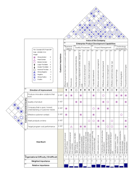
| 1. | Project Management Plan | In particular, the Quality Management Plan, the output of process 8.1 Plan Quality, describes how quality control will be performed within the project. |
| 2. | Quality Metrics | Describes the attributes to be measured, how they will be measured, and the allowable variations. This is an output of process 8.1 Plan Quality. |
| 3. | Quality Checklists | Structured lists that help verify that the work and deliverables fulfill the requirements. These are an output of process 8.1 Plan Quality. |
| 4. | Work Performance Data |
These are an output of process 4.3 Direct and Manage Project Work. |
| 5 | Approved Change Requests | These are outputs of the Perform Integrated Change Control process. |
| 6. | Deliverables | These are an output of process 4.3 Direct and Manage Project Work. |
| 7. | Product Documents |
|
| 8. | OPAs |
|
| TOOLS & TECHNIQUES | ||
| 1. | Seven basic quality tools | The same tools & techniques used in process 8.1. |
| 2. | Statistical sampling | Samples are selected and tested according to the quality management plan. |
| 3. | Inspection | Examination of the work product to see if conforms to standards. |
| 4. | Approved change requests review | The change requests should be checked to see if the approved changes have been implemented in a timely manner. |
| OUTPUTS | ||
| 1. | Quality control measurements | Documented results of control quality activities.. |
| 2. | Validated changes | Changed or repaired items are accepted or rejected by the customer. |
| 3. | Verified deliverables | Determines whether deliverables meet the quality standards. |
| 4. | Work performance information | Results from analyzing work performance data to determine such things as: causes of rejections, or the need for process adjustments |
| 5. | Change requests | All requests for changes that result from an audit are then input into process 4.5 Perform Integrated Change Control under Integration Management. |
| 6. | Project management plan updates | The following component plans are updated:
|
| 7. | Project documents updates |
|
| 4. | OPAs updates |
|
2. Tools & Techniques
The seven basic quality control tools from 8.1 Plan Quality Management are used:
- Cause-and-effect diagrams (aka fishbone or Ishikawa diagrams): for finding root cause of quality problems
- Flowcharts: for analyzing processes as a step towards improving them
- Checksheets: for collecting data on a quality problem
- Pareto diagrams: identifies those few sources that are responsible for the most quality problems
- Histograms: describes the statistical distribution of quality data
- Control charts: determines whether process is stable or predictable
- Scatter diagrams: used to indicate correlation between variables
I have reviewed these tools in previous posts. Statistical sampling and inspection are the main tools used on the deliverables themselves. Finally, any previously approved change requests are checked to make sure they are implemented.
3. Outputs
The quality control measurements from the statistical sampling and inspection are an important output of the process. Deliverables that have been approved by the customer or validated deliverables, as well as deliverables that have been verified by the quality control process are outputs of the process. Quality-related documents are also outputs.
These are the main ITTOs (inputs, tools & techniques, and outputs) of this process.
The next post will cover the purpose of the quality control process.
Filed under: Uncategorized | Leave a comment »