5th Edition PMBOK® Guide—Chapter 9: Process 9.1 Plan Human Resource Management


1.  Introduction

The first out of four human resource-related processes is a planning process, and it is used to develop the Human Resource Management Plan.

2.  Inputs, Tools & Techniques, and Outputs

The output of this process is the Human Resource Management Plan, of course.  The inputs come from other parts of the Project Management Plan, as well as the various human resource related policies and guidelines that the organization follows, either to be compliant with various laws and regulations or as a reflection of the organization’s own culture.


9.1 PLAN HUMAN RESOURCE MANAGEMENT
INPUTS
1. Project Management Plan Used to develop the Human Resource Management Plan
2. Activity resource requirements These determine the human resource needs for the project.
3. EEFs
  • Organizational culture and structure
  • Existing human resources
  • Personnel administration policies
4. OPAs
  • Organizational standard processes, policies, role descriptions
  • Templates for organization charts, position descriptions
  • Lessons learned on previous projects
  • Escalation procedures for handling issues
TOOLS & TECHNIQUES
1. Organizational charts and position descriptions These document the team member roles and responsibilities.
2. Networking Formal and informal interaction with others in an organization
3. Organizational theory Provides information on how people, teams, and organizations behave
4. Expert judgment Used in developing human resource management plan
5. Meetings Allows project team members to get consensus on implementing human resource management plan
OUTPUTS
1. Human Resource Management Plan Provides guidance on how project human resources are to managed.


The tools & techniques of human resource management vary from organizational theory, to the practical tools of organizational charts.   Expert judgment and meetings, two tools that are used in many planning processes, are also present here.

Next week I will start going into the elements of the Human Resource Management Plan.

5th Edition PMBOK® Guide—Chapter 8: Human Resources Management Knowledge Area


1.  Introduction

The next chapter, chapter 9, covers  Human Resources Management, that is, management of the people who are working on the project and the factors that influence them.

2.  Human Resources Management Processes

There are four project management processes in the Human Resources Management Knowledge Area.  One of them is in the Planning Process Group, and the other three are in the Executing Process Group.   There are no human resource processes in the Monitoring & Controlling Process Group.

The first process, that of Plan Human Resources Management, creates the Human Resources Management Plan which is the framework for all of the other processes.  The second process, that of Acquire Project Team, is in the Executing process group and is where the project manager, like the director of an orchestra, acquires his performers and their instruments.  The third process, also in the Executing process group, is Develop Project Team, and this is where the project manager, like the director of an orchestra, has them rehearse together so that they work together in concert.  The last process, likewise in the Executing  process group, is the process Manage Project Team.  What if one of the instruments is playing out of tune with the others?  Well, you need to adjust the performance of that one player.  It could be a problem with the director himself (or herself), if the piece is being played so quickly that accuracy (quality) suffers as a result.

Process Group ProcessNumber Process
Name
Process Description
Planning 9.1 Plan Human Resource Management Process of documenting project roles, responsibilities, required skills, reporting relationships, and creating a staffing management plan.
Executing 9.2 Acquire Project Team Process of confirming the availability of resources, and obtaining the members of the team.
Executing 9.3 Develop Project Team Process of improving competencies, team member interaction, and the overall team environment.
Executing 9.4 Manage Project Team Process of tracking team member performance, providing feedback, resolving issues, and managing team changes.

The project manager needs to influence the human resource factors that may impact the project.  These include the following:

  • Team environment
  • Geographical locations of team members
  • Communications among stakeholders
  • Internal and external politics
  • Cultural issues
  • Organizational uniqueness

The next post will cover the first of these processes, process 9.1 Plan Human Resources Management.

5th Edition PMBOK Guide–Chapter 8: Control Charts


1.  Introduction–Control Limits vs. Specification Limits

The control chart is an important tool of quality control.   The PMBOK Guide definition is “A graphic display of process data over time and against established control limits, which has a centerline that assists in detecting a trend of plotted values toward either control limit.”

The definition implies that on either side of the centerline, there is a control limit; one is called the upper control limit, and the other is called the lower control limit.

As I mentioned in my previous post, the control limit exists so that the process stays within the specification limit.    The analogy that comes to mind is that of the lane marker on a highway and the guard rail at the side of the road.    The guard rail is like the specification limit, in that if you go outside that limit, you are definitely “off road” and this is definitely a situation to avoid.    But in order to stay within these outer limits, the control limits in this case are like the lane markers, assuming that there is some sort of shoulder between the lane marker and the guard rail.    If you can steer your car so that you are within the lane markers (control limits), you will never have to worry about hitting the guard rails (specification limits).

2.   Assignable or special cause vs. random variation

A measurement will have some sort of variation which is due to random variables.   In practical terms, this means that the measurement will be moved off the centerline in one direction as often as it is moved in the other direction.     A common cause is the usual variation in a system, the “background noise”, if you will.

However, if there is a special or assignable cause, it will move the measurement off the centerline in a way that is not random.    The practical upshot of this is that there are certain rules about control limits that tell if a process is being affected by a special or assignable cause in such a way that it is out of control.

3.   Control chart rules

One of the first rules is that no measurement should be outside the upper control limit or the lower control limit.   This one is fairly obvious; the reason why the control limits are put in place is precisely because going outside of them indicates the process is out of control.

The second rule is the “rule of seven,” which says that if seven consecutive points are above or below the centerline, this must be due to some process which is skewing the values to one side of the center line.

The third rule is that a certain number of points are outside certain standard deviations of the measurement.    One variation of this rule is:

  • one point over 3 sigma
  • 2 out of 3 points over 2 sigma
  • 4 out of 5 points over 1 sigma

The idea here is that the number of points over 1 sigma, for example, should be only 31% or roughly 1 out of 3.   If 4 out of 5 points are over 1 sigma, or around 80%, then the number of points over 1 sigma is higher than it should be, and there is probably a special or assignable cause for this.

These rules of thumb give a project manager a way to look at control charts to detect if there is a special or assignable cause.   If the control charts indicate there is some sort of special or assignable cause, the next task is to find out what that cause is.   There are other quality tools for that.    So the control chart is the beginning of the story of shifting from monitoring to controlling quality, not the end of it.

This is the last post discussing Chapter 8 of the guide on Quality Management.   The next post will start discussing Chapter 9 on Human Resource Management.


5th Edition PMBOK Guide–Chapter 8: Quality Control


The quality of a deliverable is measured against the technical requirements obtained from the customers or sponsors of the project.    Process 8.3 Perform Quality Control is a process in the monitoring and controlling process group.    The monitoring part consists of sampling and inspecting the deliverables to see if the company can verify  the quality.   The controlling part comes if the company inspects the deliverables and see that they do not meet the technical requirements.

In that case, changes are recommended which can fed into the Perform Integrated Change Control process to see if they should be implemented or not.   Once the deliverables are verified, then can be validated by the customer or sponsor by seeing if they formally accept them as conforming to the original requirements that they set forth at the beginning of the project.

The following are three paired concepts that need to be understood with respect to quality control.

1.  Prevention and inspection

Prevention keeps errors from occurring during production.   Inspection tries to keep errors that have already occurred during production from ever reaching the customer.   Obviously PMI prefers as a matter of policy to have prevention emphasized over inspection, because it is ultimately cheaper to design in quality than “inspect” it in.

2.  Attribute sampling and variables sampling

Attribute sampling is to variables sampling as digital is to analog.   Attribute sampling just asks the question: does the sample conform or does it not conform?    Is is therefore like a digital value that could be assigned a 0 or a 1.  Variables sampling takes a measurement that is along a continuous (analog) scale, and thus the degree of conformity can be measured.

3.  Tolerances and control limits

The tolerance of a measurement is the specified range of permitted or acceptable results.   A control limit is a boundary set in order to keep all of the measurements within a specified tolerance.    The difference between a tolerance and control limit is like the difference on a highway between a guard rail and a lane marker.   The guard rail is like the tolerance limit:   if you go beyond that guard rail, you are not conforming to the road and this can be a very dangerous situation.   In order to keep you from going beyond the guard rail, there are lane markers painted on either side of a lane.  If you steer your car so that it always stays within the lane markers, then you will never have a problem having your car go off the road by going beyond the guard rail.

The concept of a control limit can be illustrated by the control limit chart tool, which is the subject of the next post.

5th Edition PMBOK® Guide–Chapter 8: Process 8.3 Perform Quality Control


This post gives an overview of the third of the three processes in the Quality Management Knowledge Area, namely process 8.3 Perform Quality Control, by listing the inputs, tools & techniques, and the outputs of the process.   Perform Quality Control belongs to the Monitoring & Controlling Process Group, and focuses on the product or deliverables, as opposed to the previous process 8.2 Perform Quality Assurance (in the Executing Process Group) looks at the processes.

1.  Inputs

The first three inputs come the first quality process, process 8.1 Plan Quality.  Some inputs from the Integration Knowledge Area (Work Performance Data and Approved Change Requests), and of course the deliverables themselves which are to be sampled and inspected as a part of this process.  Finally, all the quality-related documentation is an input to this quality control process as well.

8.3 PERFORM QUALITY CONTROL
INPUTS
1. Project Management Plan In particular, the Quality Management Plan, the output of process 8.1 Plan Quality, describes how quality control will be performed within the project.
2. Quality Metrics Describes the attributes to be measured, how they will be measured, and the allowable variations.  This is an output of process 8.1 Plan Quality.
3. Quality Checklists Structured lists that help verify that the work and deliverables fulfill the requirements.  These are an output of process 8.1 Plan Quality.
4. Work Performance Data
  • Planned vs. actual cost performance
  • Planned vs. actual schedule performance

These are an output of process 4.3 Direct and Manage Project Work.

5 Approved Change Requests These are outputs of the Perform Integrated Change Control process.
6. Deliverables These are an output of process 4.3 Direct and Manage Project Work.
7. Product Documents
  • Quality audit reports and change logs supported with corrective action plans
  • Process documentation obtained using the seven basic quality tools of process 8.1 or the quality management and control tools of process 8.2
8. OPAs
  • Organization’s quality standards and policies
  • Issue and defect reporting procedures
TOOLS & TECHNIQUES
1. Seven basic quality tools The same tools & techniques used in process 8.1.
2. Statistical sampling Samples are selected and tested according to the quality management plan.
3. Inspection Examination of the work product to see if conforms to standards.
4. Approved change requests review The change requests should be checked to see if the approved changes have been implemented in a timely manner.
OUTPUTS
1. Quality control measurements Documented results of control quality activities..
2. Validated changes Changed or repaired items are accepted or rejected by the customer.
3. Verified deliverables Determines whether deliverables meet the quality standards.
4. Work performance information Results from analyzing work performance data to determine such things as:  causes of rejections, or the need for process adjustments
5. Change requests All requests for changes that result from an audit are then input into process 4.5 Perform Integrated Change Control under Integration Management.
6. Project management plan updates The following component plans are updated:

  • Quality management plan
  • Process improvement plan
7. Project documents updates
  • Quality standards
  • Quality audit reports
  • Process documentation
4. OPAs updates
  • Completed checklists
  • Lessons learned documentation:  causes of variances, reason for corrective action chosen, and other lessons from quality control.

2.  Tools & Techniques

The seven basic quality control tools from 8.1 Plan Quality Management are used:

  •  Cause-and-effect diagrams (aka fishbone or Ishikawa diagrams):  for finding root cause of quality problems
  • Flowcharts:  for analyzing processes as a step towards improving them
  • Checksheets:  for collecting data on a quality problem
  • Pareto diagrams:  identifies those few sources that are responsible for the most quality problems
  • Histograms:  describes the statistical distribution of quality data
  • Control charts:  determines whether process is stable or predictable
  • Scatter diagrams:  used to indicate correlation between variables

I have reviewed these tools in previous posts.  Statistical sampling and inspection are the main tools used on the deliverables themselves.  Finally, any previously approved change requests are checked to make sure they are implemented.

3.  Outputs

The quality control measurements from the statistical sampling and inspection are an important output of the process.  Deliverables that have been approved by the customer or validated deliverables, as well as deliverables that have been verified by the quality control process are outputs of the process.  Quality-related documents are also outputs.

These are the main ITTOs (inputs, tools & techniques, and outputs) of this process.

The next post will cover the purpose of the quality control process.

Things Fall Apart by Chinua #Achebe, War of the Worlds, and Avatar


This evening I watched a science-fiction movie that came out three years ago, Avatar.    When I saw it as it first came out in the theaters, I was blown away at first by the world-creation that James Cameron had undertaken of the planet Pandora in the telling of the story of the film.    I read somewhere in the blogosphere that the plot of the movie was similar to that of another groundbreaking film from 1990 called Dances with Wolves.   Basically the movie starts off with the main character identifying as one of the colonial invaders into the land of a native people whose lifeways are being disrupted by their invasion.   Gradually the main character’s perspective changes to that of the native people and he is caught looking at his own culture through their eyes.    The difference in Avatar was that he helped them fight back–and they ended up winning!   It took the medium of science-fiction to criticize our own culture through the lens of a fictional set of aliens.

H. G. Wells was sympathetic to the various colonial peoples subjugated by the British empire, and decided to try to create a way for the British people to empathize with them through the medium of science fiction as well in his book War of the Worlds.   What if an alien race treated the British, and indeed all of humanity, in the same way that the British were treating various peoples around the world?    The result is his invention of a race of Martians whom he described in his opening lines as follows …

“No one would have believed in the last years of the nineteenth century that this world was being watched keenly and closely by intelligences greater than man’s and yet as mortal as his own; that as men busied themselves about their various concerns they were scrutinised and studied, perhaps almost as narrowly as a man with a microscope might scrutinise the transient creatures that swarm and multiply in a drop of water.”   Notice the lack of empathy of the Martians who saw man in the same dispassionate way that men study microbes.

In Things Fall Apart, you get to know the main character Okonkwo and see the life of his tribe in pre-colonial Nigeria through his eyes.   Then after the scene is set, the culture of his tribe is gradually distorted, and then destroyed by the colonial British who are colonizing Nigeria.    The culture’s destruction is presaged in the destruction of Okonkwo himself, and then, in the midst of sorrow for the passing of the hero, the last chapter’s perspective suddenly changes.

Rather than going from the colonizer to the colonized, like Avatar and Dances with Wolves, the last passage switches from the viewpoint of the colonized to that of the colonizer, and the tribe that Okonkwo comes from is described with the same scientific detachment and lack of empathy which H. G. Wells described men having towards microbes or, in his fictional tale, of Martians having towards men.

I read the story years ago in college, and out of respect for Chinua Achebe’s recent death, decided to re-read it.   Nothing prepared me for the shock of the ending, not just the death of the protagonist, or the death of a culture, but the death of perspective that the very last of the book describes.

I think that is why Avatar, Dances with Wolves, and War of the Worlds have all appealed to me because they do promote empathy with the other.   And the reason why Chinua Achebe’s Things Fall Apart is a pleasure to read, although a difficult pleasure indeed, is because it shows clearly the beauty of another culture and the contrasting ugliness of a mindset that, unlike the greeting of the Nav’i people “I see you” in Avatar,  says essentially “I do NOT see you”.   Without the gift of empathy, which a writer like Chinua Achebe can nurture, it may be impossible for those here to see that they have more in common with the rest of the people of the world than they could ever have imagined at first.

We are one family, after all.

5th Edition PMBOK Guide–Chapter 8: Matrix Diagrams


1.  Introduction

The last of the seven quality management tools that may be used in conjunction with process 8.2 Perform Quality Assurance is that of matrix diagrams.

The matrix diagram is used to show relationships between a single set of factors or between 2 or more sets of factors. It differs from the prioritization matrix in that the prioritization matrix tries to quantify the ranking among the factors. The matrix diagram gives a qualified relationship between the factors, denoting the relationship with symbols like + for a positive relationship or a – for a negative relationships.

2.  Example–House of Quality (HOQ) tool

An example of this can be found in the House of Quality tool that demonstrates the method of Quality Function Deployment (this image is taken from Wikipedia).


Notice the “roof” of the house which contains the relationships between the various design features proposed for this product development. If two factors influence each other positively, there is a circle, with a dot in the circle for a strong positive influence. On the other hand, if there is an X, that means there is a negative influence between the factors. If the influence between the factor is weak, there is a triangle. This is, of course, a single example; other companies may use other symbols to represent similar types of relationships.

By the way, you may notice that in the “basement” of the House of Quality model, there is a list of weighting factors underneath each design feature which demonstrates an example of the prioritization matrix that was talked about in a previous post; it is tool #5 out of 7 of the quality management tools.

In fact, you can convert a matrix diagram into a prioritization by taking each of the symbols for strong, medium, or weak relationships (both positive and negative) and assigning them a weighting factor from 0 to 9 and then adding up the various values for the symbols.

Finally, the website http://www.syque.com/quality_tools/toolbook/Matrix/how.htm gives the following examples of the different types of matrices that can be used to compare a set of factors (L-type matrix), two sets of factors (T or X-type matrix), or even three sets of factors (C-type or Y-type) in a three-dimensional matrix.

The matrix diagram is therefore used to chart the complex interrelationships between various one, two, or three sets of factors. It is used to focus on the complicated details of a particular aspect of a problem that has been previously identified and broken down using some of the other tools mentioned in previous posts in this series.

This concludes the survey of seven quality management tools that can be used in conjunction with process 8.2 Perform Quality Assurance.    Next week I will describe the last of the three quality processes, 8.3 Perform Quality Control.

5th Edition PMBOK® Guide–Chapter 8: Activity Network Diagram


1.  Introduction

This is the sixth in the series of posts on 7 different quality management tools that can be used in conjunction with process 8.2 Perform Quality Assurance.   This last tool is that of activity network diagrams.   In connection with project management, they are mostly associated with project scheduling.

If you are asked:  how long will this project take, you need to create an activity network diagram. Once you create the diagram you need to figure out the critical path, which is the path from the start to the finish of the project with the longest cumulative duration.  Those activities on the critical path may not be delayed without delaying the schedule as a whole. Other activities that are NOT on the critical path may be delayed for a certain period of time without affecting the schedule, and the amount of “wiggle room” in the schedule for any given activity is called the float of that activity.

2.  Creating an activity network diagram

First step is creating the activity network diagram.

Step Description
1. Define Activities Take the work breakdown structure or WBS, which takes the general objectives of the project and breaks them down into deliverables. Then take each deliverable and list all activities it will require to accomplish it.
2. Sequence Activities Sequence the activities based on the precedence relationship between them. Some activities have to be completed before others are started, for example. Other activities may be able to be done simultaneously. Based on these relationships between activities, create a network diagram that looks like a flowchart with a box for each activity.
3. Estimate Activity Durations Add a duration to each of the boxes containing the activities.
4. Critical Path Method Calculate the duration of the various “branches” of the network in order to determine which branch is the critical path of the network.
5. Calculate “Float” or “Slack” Using the forward pass and backward pass method, calculate the total float or slack of each of the activities. NOTE: An activity on the critical path will have ZERO float BY DEFINITION

2. Critical path method

To determine how long a project will take, you need to find out the critical path, that is, the sequence of activities in the network diagram that is the longest. Other paths along the network will yield sequences of activities that are shorter than the critical path, and they are shorter by an amount equal to the float. This means that activities that have float could be delayed by a certain amount without affecting the schedule. Activities along the critical path have a float of zero. This means that any delay along the critical path will affect the schedule.

Here’s an outline of the critical path methodology.

a. You create a network diagram of all the activities.

b. You label each activity with the duration derived from process 6.4 Estimate Activity Durations.

c. You do a forward pass to determine the early start and early finish date of all activities, from the start of the project to the end of the project.

d. Once at the end of the project, you do a backward pass to determine the late start and late finish date of all activities, from the end of the project to the start of the project.

e. For each activity, you use the results of c and d to calculate the float of each activity.

f. All activities that have 0 float are on the critical path for that project.

3.  Critical path method–alternative

In practice, an easier way to get the float of each activity is to do the following:

a. You create a network diagram of all the activities.

b. You label each activity with the duration derived from process 6.4 Estimate Activity Durations.

c.  List the various paths in the network.

d.  Find out which path has the longest duration:  that is the critical path.

e.  All activities on the critical path have 0 float by definition.   Label all those activities with 0 float.

f.   Find the path with the next-highest duration compared to the critical path.    Calculate the difference between that duration and the duration of the critical path:   that is the float for any activity that has NOT already been labeled as having 0 float (in step e).

g.  Keep finding the path with the duration that is next-highest, calculate the difference between that duration and the duration of the critical path:   that is the float for any activity that has NOT already been labeled with a float in previous steps.

This method is faster than using the forward and backward pass method, which is important on the PMP or CAPM certification exam when time is your main constraint.


The final post tomorrow will deal with the seventh quality management tool used in conjunction with process 8.2 Perform Quality Assurance, that of matrix diagrams.

5th Edition PMBOK® Guide–Chapter 8: Prioritization Matrices


1.  Introduction

There are seven quality management tools listed by the 5th Edition PMBOK® Guide as being tools & techniques of the process 8.2 Perform Quality Assurance.    The 5th tool out of these 7 tools is listed as prioritization matriceswhich aids the decision-making process by helping prioritize or rank various alternatives for implementation.

The prioritization matrix is also called the criteria matrix.   It can be used when deciding which Six Sigma projects to work on, in deciding which design features are Critical to Quality (as part of Quality Function Deployment using a tool called The House of Quality), or in making a decision with regards to any set of criteria such as the frequency, severity, and difficulty of dealing with a set of risks.

2.  Methodology of Prioritization Matrices

The table below outlines the typical methodology used in constructing one of these prioritization matrices.

Step Description
1. Develop Criteria These are the dimensions which you will use to analyze the various options. They should be listed on a row at the top of the matrix.
2. Determine Options What are the various options under consideration? They should be listed on a column to the left of the matrix.
3. Develop Weighting Each criteria should be assigned a numerical weight from 1 to 10, or some other similar scale.
4. Score Each Option Take each option and go across the list of each criteria, giving them a weighting from 1 to 10 based on the scale you developed in step 3. Each row should have the various weightings for each particular option across the various criteria.
5. Add up Columns Take the total scores for each column and each row. Sum up the columns and rows (check: they should be equal).
5. Rank Options Let’s say the total comes to 100. Then divide the total for each row by the total for the entire matrix, which will then give you a decimal ranking from 0.00 to 1.00 for each option. Rank each options with the highest decimal ranking at the top, and going downwards from there.  Or you can simply list the rankings on a numerical basis without the decimal conversion; it’s your choice.
6. Discuss Results Discuss the results of the exercise and make a decision based on the option with the highest score.

This tool is used only after the various options are clearly known, so it is best that this tool be used after some other brainstorming tool, such as multi-voting, the nominal group technique, or the Ishikawa or fishbone diagram, is used to identify those options.

The next post will cover the sixth out of the 7 quality management tools that may be used in process 8.2 Perform Quality Assurance, namely activity network diagrams or arrow diagrams.

5th Edition PMBOK® Guide—Chapter 8: Tree Diagrams


1.  Introduction

There are seven quality management tools listed under the tools & techniques for process 8.2 Perform Quality Assurance.   This post is on the 4th out of the 7 tools listed, Tree Diagrams.

A tree diagram, also known as a systematic diagram, can be used to represent decomposition hierarchies such as the Work Breakdown Structure.   A tree diagram is used to communicate logical relationships between critical events (such as with failure tree analysis) or specific objectives (decision tree analysis). One event may cause another, and that new event may cause a series of others, so you have a hierarchical relationship that resembles the branching of a tree.

2.  Example:   Decision Trees

In the context of project management, it can also be used to calculate the expected monetary value of a series of alternatives faced when making a decision, hence the term decision trees in this context.  In risk analysis, the expected monetary value is computed by taking the a) probability of an alternative and multiplying it by b) the monetary impact of that alternative.

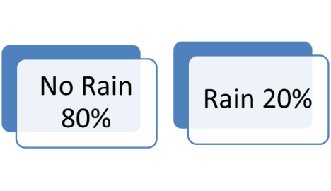
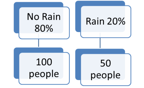
Let’s say you are putting on a company picnic, and you pick a weekend date for it. You are holding a raffle for charity that costs $5 per ticket and you want to calculate how much money you think you will make on the raffle. You have to have some allowance for if it rains. Let’s say the long-term weather forecast is for it to have an 80% chance of clear skies or scattered clouds, and 20% chance of rain. If you are trying to forecast how much money you will make, then you have to account for both probabilities, whether it will rain or not rain.

Now if it is does not rain, your past experience tells you that there will be 100 people that show up. If it does rain, again your past experience tells you only half the people will show up, giving you only 50 people that will come to the event.

In either case, your past experience tells you that each person on average buys 2 tickets that cost $5 each, so each person spends $10 on the raffle on average.

Now what is the expected payout for the event? In the case of “No rain”, there will be 100 people X $10 spent per person or $1000. In the case of “Rain”, there will be 50 people X $10 spent per person or $500. However since the probability of “No rain” is 80%, and the probability of “Rain is” is 20%, the expected payout will be on average

(Probability of “No rain”) X (Payout of “No rain”) +

(Probability of “Rain”) X (Payout of “Rain”) = (80% X $1000) + (20% X $500) = $800 + $100 = $900.

It can be used in decision making, where the decision tree consists of 3 types of nodes:-

a. Decision nodes – commonly represented by squares

b. Chance nodes – represented by circles

c. End nodes – represented by triangles

In the example above, whether it rains or not rains would be represented in squares, the probabilities of 80% and 20% would be represented by the circles that lead from these squares, and the end result we’ve listed above ($800 payout for “No rain” and $100 payout for “Rain”) would be represented by triangles at the end of the branches.

3.   Another Example:  Fault Trees

Tree diagrams can also be used in failure mode analysis, where instead of decision trees, you have fault trees,where instead of decisions, you have critical events that occur in the failure of the part. Each of these will have events that cause these failures, and these events will have their causes and so on, where eventually you get to the root causes.

In project management, breaking down a project into activities through the work breakdown structure could also be considered an example of a tree diagram.

4.  Conclusion

Tree diagrams can help visualize logical or hierarchical relationships between events, objectives, or tasks. In certain applications, such as risk management, it helps identify the probabilities of the various outcomes, which helps in the calculation of the relative contribution each “branch” makes.

The next post will cover the fifth out of seven quality management tools used in process 8.2 Perform Quality Assurance, that of prioritization matrices.